


6 Tips for a Blog That Feels Like You
Contents

This post was automatically translated by AI from the Japanese original. The screenshots are in Japanese.
For people who work on their own, a blog or website is like a second self on the internet.
You want it to reflect who you are and look nice, too.
But even when you line up photos and colors you like, it can still end up feeling inconsistent.
In this post, I’ll share what I keep in mind when creating a look that feels like mine.
They’re all easy to do, so please give them a try.
#1 Start by deciding on a concept
A concept is the image you want to express, put into words.
Once you’ve decided how you want people to feel when they see your blog, it gets much easier to choose concrete design elements.
- What kind of atmosphere do you want?
- What feelings do you want to share?
Try thinking up some keywords.
Then combine a few of them to make your concept.
For example, this blog is based on the image of “a web wizard’s atelier in the forest”.
The web feels like magic to me: it brings what you imagine to life and makes difficult things easy in a flash.
But that alone feels a bit cold, so I wanted to add the warmth of wood and some analog touches. That’s how I arrived at a forest atelier.
I’ve always loved fantasy, so I put in the things I like.
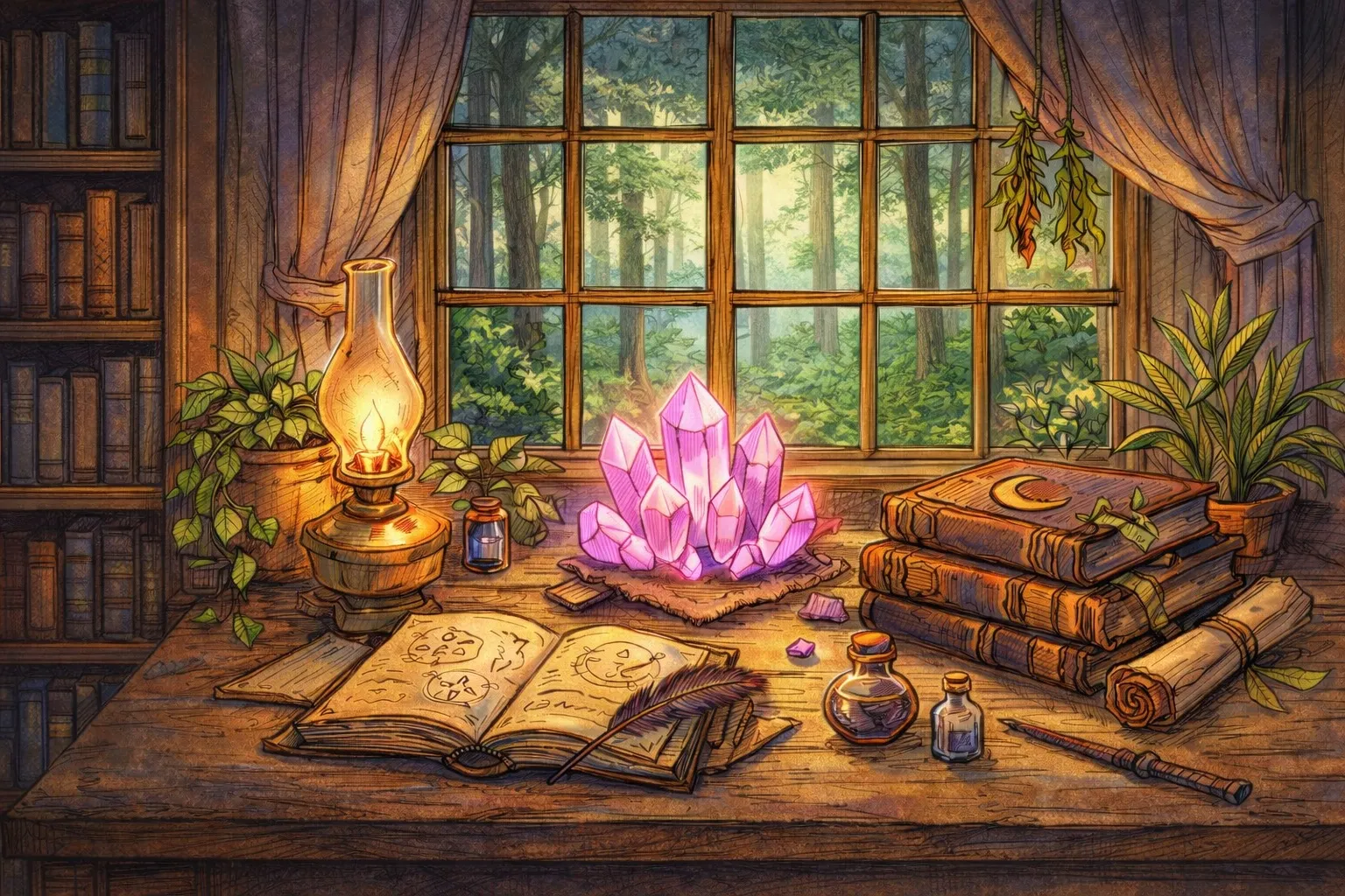
This is what I get when I ask AI to draw the images I love.
#2 Derive design elements from the concept
Once you have a concept, decide on the design elements from it.
There are three main design elements:
- Color
- Motif
- Font
These three are the easiest things to change on a blog or website.
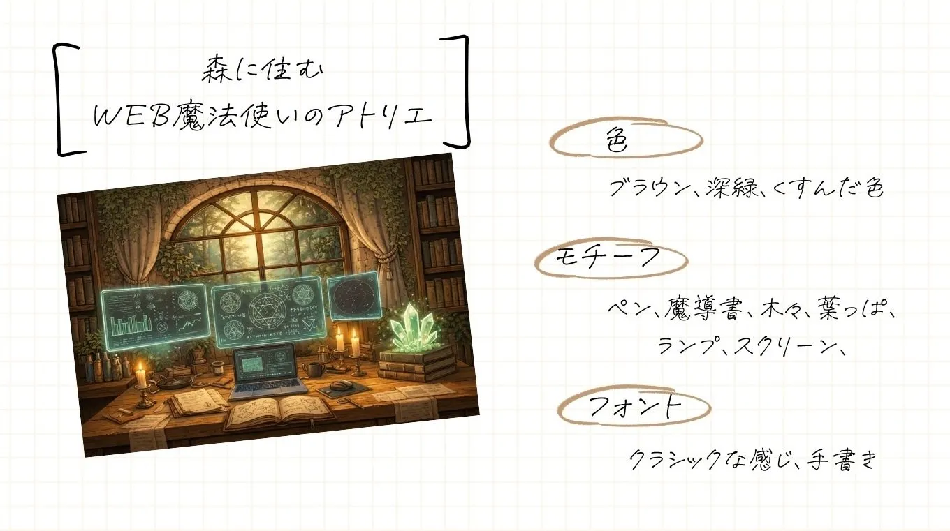
Expand your ideas and jot them down.
#3 Narrow your colors down to three
Based on your concept, decide on three colors for your website.
- Base color
- Main color
- Accent color
I pick colors with a tool called coolors.
I think it works well to first look for colors close to your image in the catalog guide, then open the palette and adjust the colors.
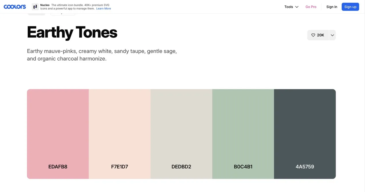
coolors is so handy!
If you use Canva, you could also try placing colors on a design to see how they look.

Base color
The base color is used for backgrounds and margins.
You can use white, and beige tones are also lovely and easy on the eyes.
Text and photos will sit on top of it, so choose a color that’s as light as possible.
Main color
This is the color used most often across your site.
In particular, I use it for buttons and headings.
To match my forest atelier concept, I chose a wood brown.
Accent color
This is the color for links and emphasized parts.
Choose one that goes well with your main and base colors and fits your concept.
I chose green, to feel like the forest.
Check the colors in your blog’s settings
Many blogs let you set the basic colors.
In SWELL (a Japanese WordPress theme), you can set them under Appearance > Customize > Site-wide Settings > Basic Colors.
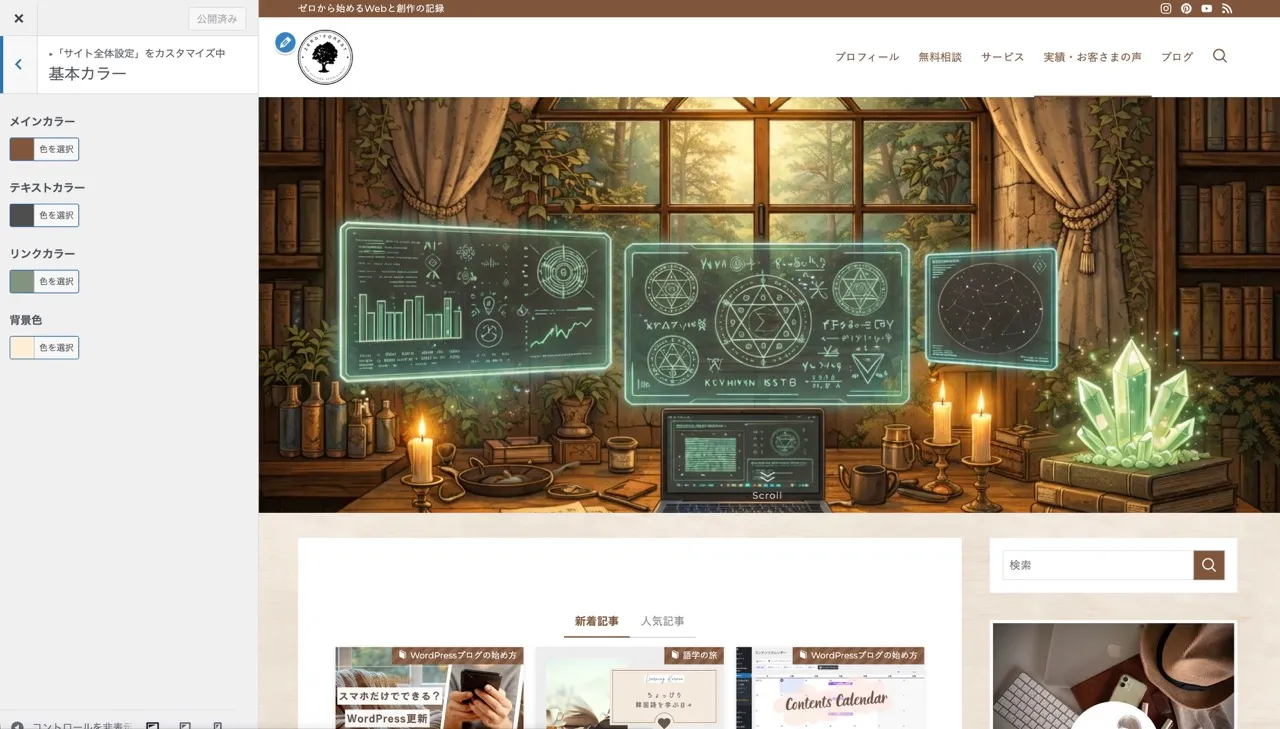
Set each one and take a look.
Colors often look different on the actual blog than when you picked them, so if that happens, go back to the color palette and adjust.
#4 Use motifs subtly
If you use motifs too much, or mix too many different ones, the decoration becomes overwhelming and noisy.
If you’re unsure, it’s fine not to force it.
Just a touch as an accent is about right.
Use them in your main visual and icon
It’s the first place people look, so use an image that fits your concept as the main visual!
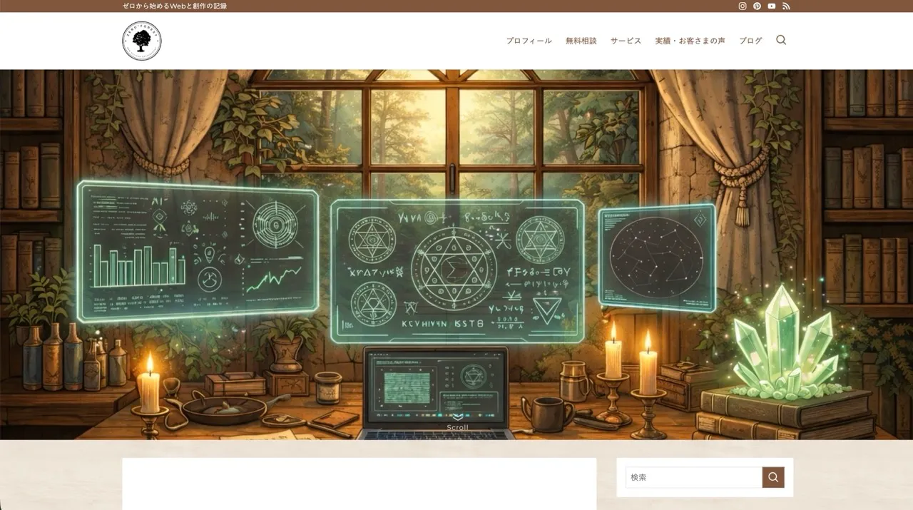
I made a header image that’s pure hobby.
Your icon gets bookmarked and works as a landmark for your site, so using a motif there is a good idea.

The icon I’ve kept using all along, for better or worse.
To match my concept (a forest web wizard’s atelier), I included a tree silhouette.
I also use a wood-grain pattern for the background of the whole blog.
Heading and divider designs
You can also add decoration using motifs inside your blog posts.
- A small icon next to headings
- Dividers decorated with a motif
- Motifs in decorative frames
In SWELL, you can insert icons into your text from the text menu.
For finer adjustments, you’ll need to customize with HTML/CSS.
#5 Fonts: readability plus an accent
The same text can give a different impression with just a different font.
Japanese fonts come in two broad types: Mincho (serif) and Gothic (sans-serif).

- Mincho (serif)
- Noto Serif JP
- Yu Mincho
- Hiragino Mincho
- Gothic (sans-serif)
- Meiryo
- Hiragino Kaku Gothic
- Yu Gothic
- Noto Sans JP
Mincho feels elegant and calm, and is often used in long novels and business documents.
Gothic is simple, easy to read and practical, and is widely used.
Gothic comes in an angular “kaku gothic” and a rounded “maru gothic”. Maru gothic gives a more casual, gentle impression.
There are also brush-style and display fonts, but they aren’t suited to long text, so I think they work best as accents for parts you especially want to stand out.
For body text, readability matters most
On websites and blogs, Gothic is used most often.
No matter how distinctive your style is, readers will leave if the text is hard to read.
In SWELL, you can choose it under Appearance > Customize > Site-wide Settings > Overall Design.
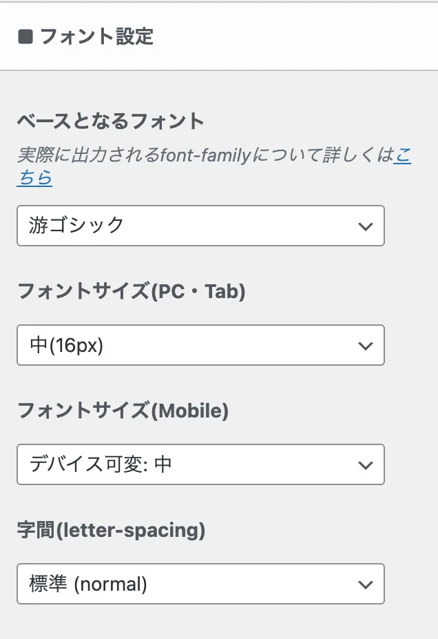
Using web fonts such as Google Fonts widens your choices a little.
But it needs extra setup, so I’ll write another post if there’s demand.
On free blogs, the font is usually fixed and you may not be able to customize it.
In that case, put some thought into the text that goes inside images, like titles and featured images.
Use stylish fonts in your featured images
For distinctive fonts, limit them to titles and headings, or use them inside your featured images.
There are lots of fonts out there, so it helps to pick ones that suit your image, one for Japanese and one for English, in advance.
#6 Reuse things to keep your design consistent with less effort
In your day-to-day writing, keep your text colors and marker colors consistent.
When you make images, keep the colors and fonts consistent too.
Reusing what you’ve decided on is efficient and makes it easier to create a sense of unity.
In SWELL, it’s handy to set your frequently used colors
SWELL lets you set frequently used colors in dark and light versions.
If you set them at the start, it becomes easy to reuse the same ones.
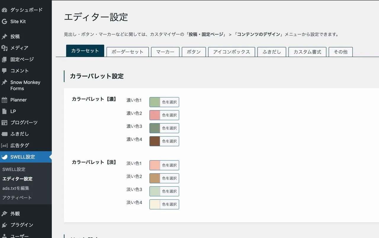
SWELL settings > Editor settings
You can also set colors for markers, buttons, frames and so on.
In Canva (Pro), use the Brand Kit
In Canva, the Brand Kit lets you register the colors, fonts, logo, photos and more that you’ve chosen for your blog.
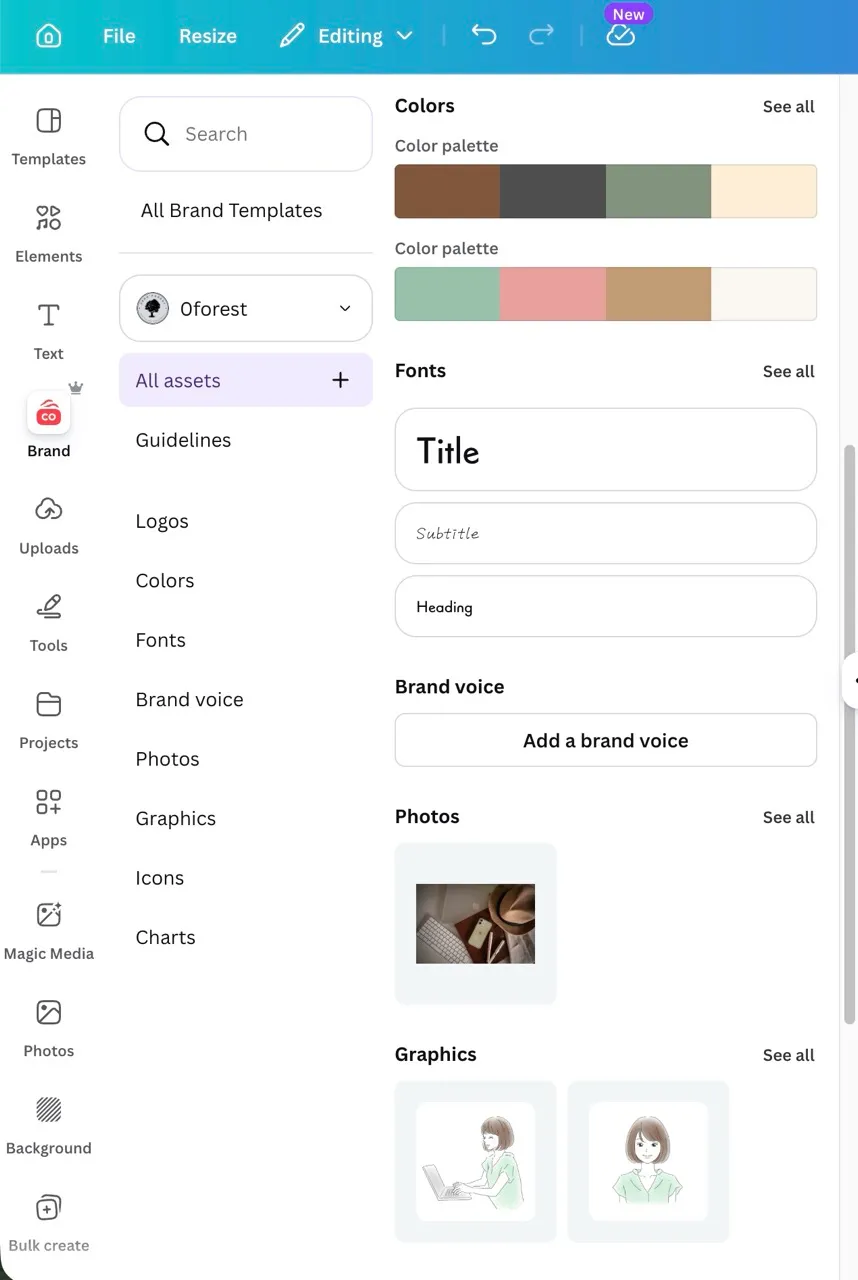
Canva’s Brand Kit
When you create a new image, you can use what you set in the Brand Kit right away, which is convenient.
Even on the free version, just keeping your frequently used colors and fonts together in some file makes it easier not to get lost!
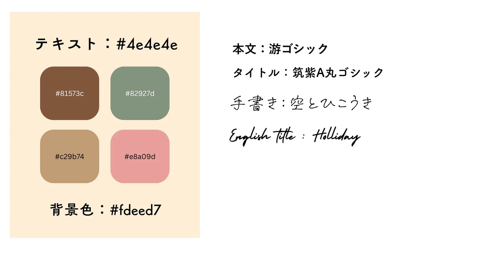
Recording my color palette and frequently used fonts
Related posts about design
📖 If you’re unsure about choosing colors, see this article too (in Japanese)


